About this project
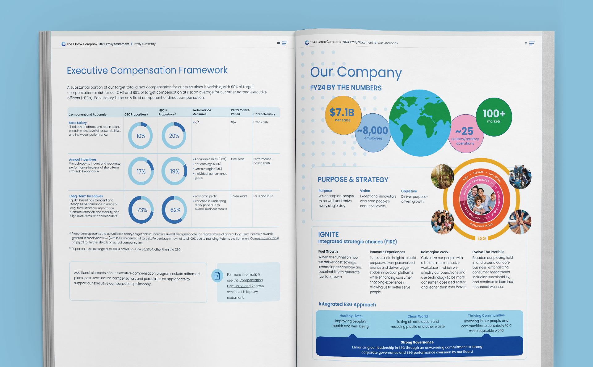
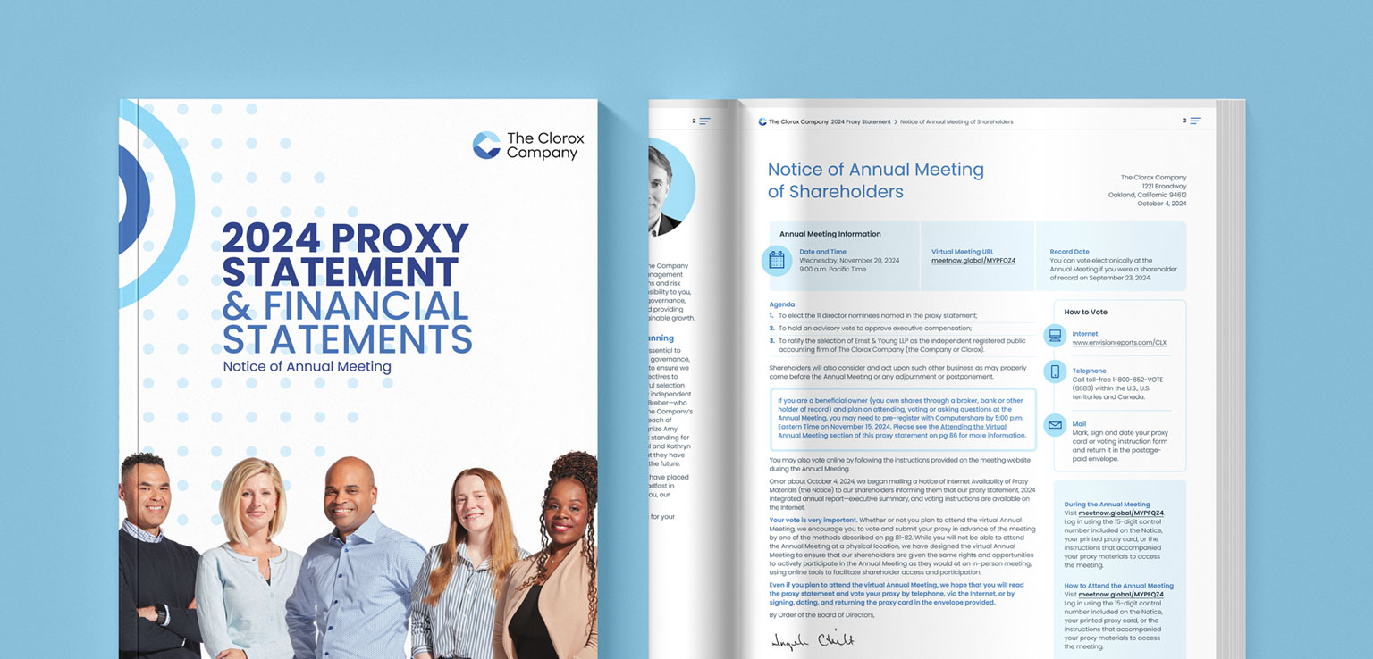
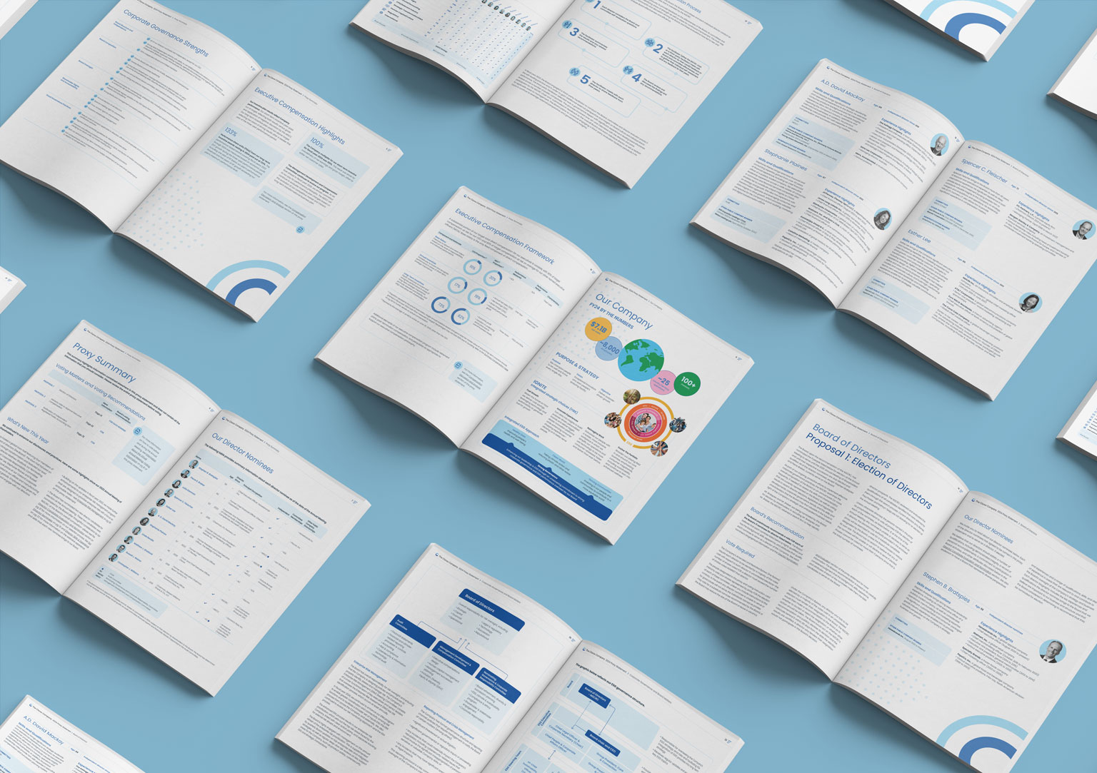
Our initial engagement with The Clorox Company on the design and production of their 2024 Proxy Statement was marked by strategic visual communication and an improved print report. The design focused on attention to detail, utilizing a cohesive blue-tone palette to enhance readability while delivering a polished, professional look. Infographics, flow charts, and tables helped simplify complex information, guiding readers seamlessly from one section to the next.
In addition to delivering a visually engaging report, we ensured full regulatory compliance, balancing creative expression with the necessary legal and financial disclosures. The improved print version met high standards of quality, further reflecting The Clorox Company’s commitment to transparency and excellence in governance.
Engaging Visuals
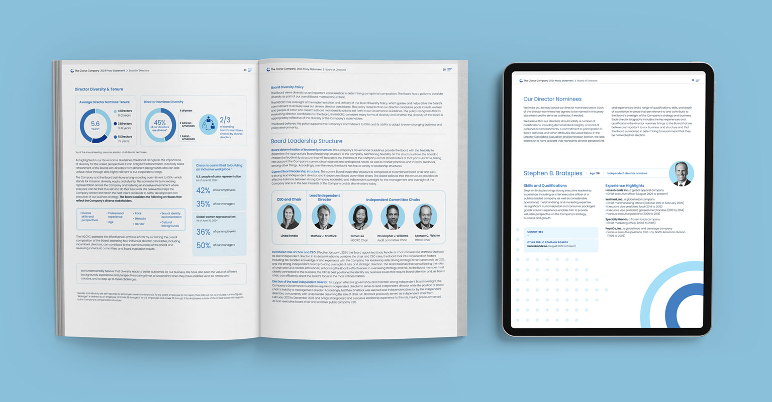
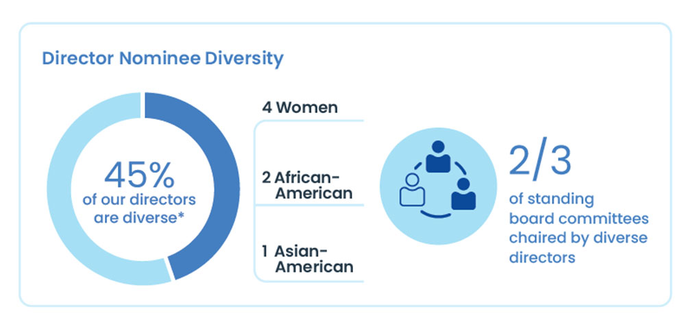
The graphic uses clean, simple illustrations and color contrast to make key concepts about diversity easily understandable. The pie chart, icons, and bold typography work together to visually emphasize important metrics, helping readers quickly grasp the company’s diversity efforts without overwhelming them with text. This thoughtful design approach enhances clarity and engagement.
Clarity in Leadership
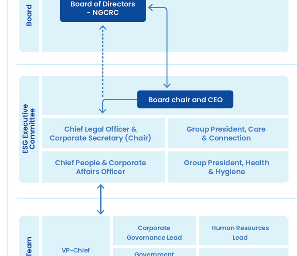
This clear, detailed graphic effectively communicates the relationships between leadership roles, such as the Board of Directors and executive committees. The use of defined lines, clean typography, and a structured layout ensures that readers can easily navigate the company’s leadership organization. By distilling complex governance into a simple, streamlined format, this flowchart not only informs but also reinforces the company’s commitment to transparency and responsible management.
